
Extra Butter
Extra Butter Packaging Design & Social Media Creatives
Packaging Design & Social Media Curation
Food & Beverage Industry
August 2020 to November 2020
My Role: Graphic Designer
Objective: My aim to craft a visually irresistible digital presence that made Extra Butter’s new cookie brand instantly crave-worthy and easy to order online.
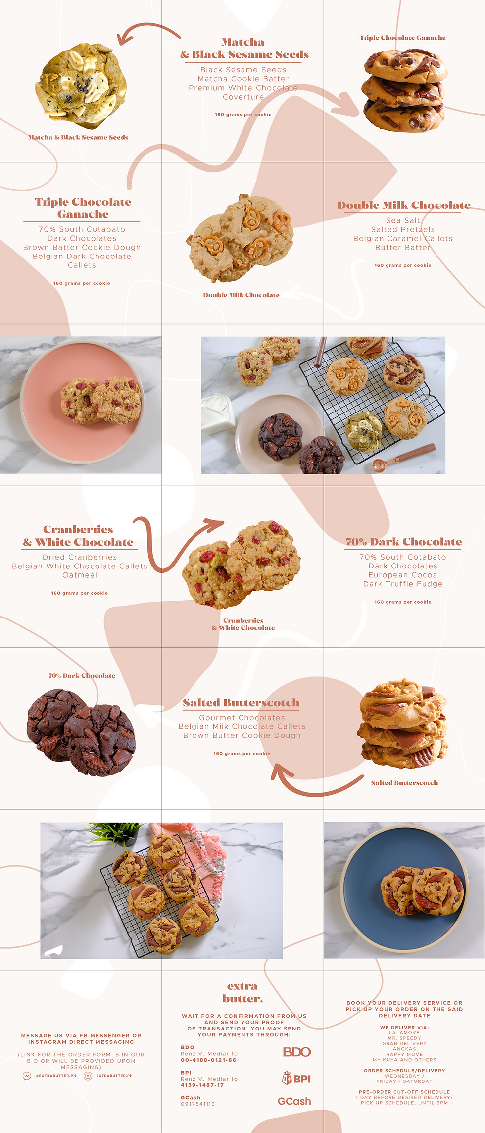
“A Soft-Baked Launch in a Digital-Only World”
Extra Butter was a newborn, online-only cookie brand launching in the middle of lockdown, a time when a dessert had to look irresistible on a screen before it ever reached a doorstep. I shaped its photography, social presence, and packaging into a soft-modern identity that spotlighted its thick, flavor-loaded cookies and made them crave-worthy at first glance.
With a young audience hungry for local treats and a crowded online dessert market, the brand needed visibility, clarity, and a standout first impression. The challenge was simple but urgent: show what made these cookies special, guide people through easy online ordering, and build packaging that protected big, hefty cookies without losing the brand’s charm.

Insights: “Lead With Flavor, Wrapped in Soft Modernity”
Early research confirmed a simple insight: the target audience responded to brands that looked fresh, delicate, and thoughtfully curated. Extra Butter already leaned into a gentle, pastel-pink identity, so the strategy was to amplify that softness while letting the cookies’ bold ingredients take center stage.
The creative direction focused on mouth-watering visuals, clean layouts, and a tone that felt youthful and approachable. Every decision aimed to strengthen brand resonance and convert craving into clicks.

Package design for cookie box: Outer Box

Package design for cookie box: Inner Box
Execution: “Where Chunky Cookies Became the Star of Every Scroll”
My work covered both digital content and physical experience. I produced most of the brand’s social materials across Instagram and Facebook, focusing on high-impact food photography that highlighted each cookie’s texture and ingredients. Content emphasized flavor variety and the convenience of ordering for delivery, two major selling points at the time.
I also designed Extra Butter’s cookie box, ensuring it fit up to six large cookies securely while aligning beautifully with the existing brand palette and personality. Beyond the aesthetic, the structure and material needed to withstand transport without compromising presentation. Every touchpoint, from feed posts to packaging, was designed to feel cohesive, warm, and crave-inducing.


Results: “Crave-Worthy Design That Boosted Engagement”
The refreshed social content led to stronger engagement during lockdown, helping the young brand expand its reach and build trust purely through visuals. The packaging performed well in real-world use, protecting the cookies and becoming a share-worthy part of the customer experience. This aided in giving the brand a strong appeal in the market, and even received a feature in When In Manila. The project gave Extra Butter a polished, consistent presence, and it gave me a chance to refine the kind of food-forward, aesthetic-driven design that resonates strongly in digital F&B spaces.


